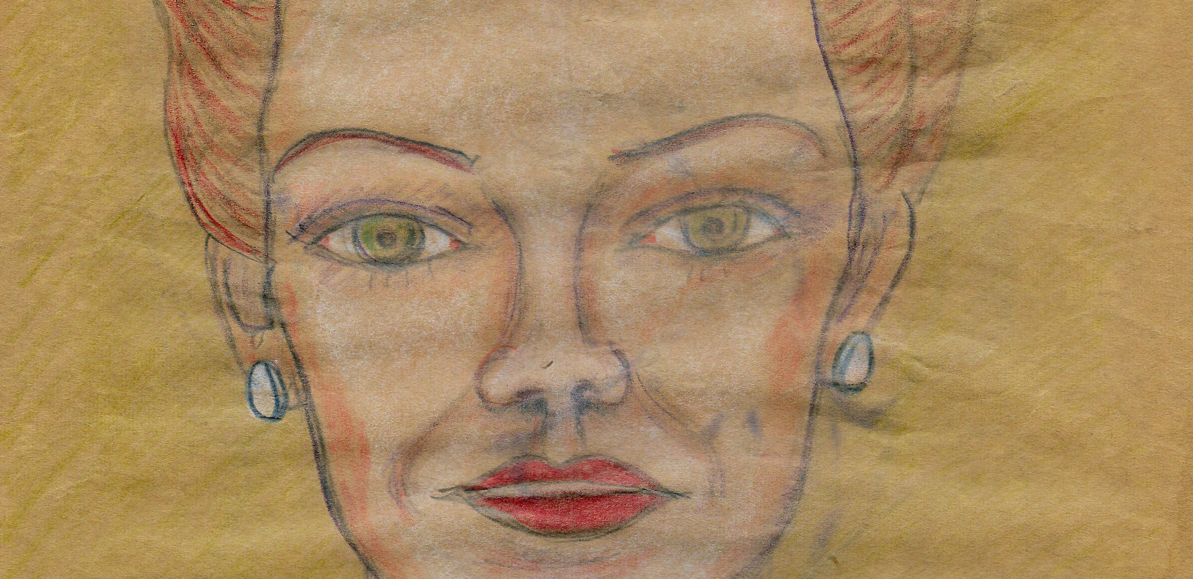
EPHEMERAMA: Hollywood
Part II
Online Exclusive
Since publishing Part 1 of EPHEMERAMA: Hollywood we’ve managed to find source material for several drawings in Hollywood fan magazines and more general publications like LIFE, a few of which are portraits of women featured in printed ads. All of the material we’ve found so far dates from 1949 and 1950.
But as we work on providing a context for these drawings, it’s heightened the need to discuss a larger context: the role of race in Hollywood.
In the period under review, the 1930s-1950s, diversity in Hollywood meant a Black woman playing an enslaved person or domestic worker, often the actress Hattie McDaniel, who won a Best Supporting Actress Oscar for her role in Gone With the Wind in 1939, the first Black person to be nominated for and to win an Academy Award. Wearing blackface was considered a funny joke, and oppression with a dose of appropriation meant that Black people – and indeed any people of color – were typically mocked at best, and predominantly left out of the movie industry. In fact, those few actresses and entertainers selected to ascend to meatier roles tended to be fair-skinned, with a look and style that mimicked the White actresses holding court in the industry.
This lack of recognition and access to the kinds of roles that would win awards persisted (and arguably, still does.) Halle Berry was the first Black woman to win a Best Actress Oscar – in 2002. 63 years passed between Hattie’s and Halle’s wins, and as of 2020, no Black man or woman has won an Oscar for Best Director; John Singleton became the first Black man nominated for this award in 1991, and somehow, Spike Lee has only been nominated once – in 2018.
This is all to say that the past few weeks of looking through endless magazines, promotional shots, and film credits for this project has helped highlight how long and pervasive this dangerous marginalization can be.
So how can a project focused on this time period help us to retell and re-contextualize a history that incorporates exclusion and oppression? In Part 2, we have decided to include examples of advertisements and magazine images from the time that were made for Black audiences. Our hope is that by seeing the products sold to Black women – such as skin-lightening creams – and comparing the language used in these ads to what was sold to Caucasian women, we can visualize how an industry developed to almost quite literally, turn Black women into White women, upholding a flawed standard of beauty that still persists today.
Updates and additional images will continue to be posted to this page and shared via Shelter’s newsletter: sign up here.
All work is available for sale, and each piece is priced at $300 (not inclusive of tax or shipping.) 10% of each sale will be donated to Housing Works, an essential organization that provides support to New Yorkers living with HIV/AIDS and to individuals with unstable housing.
Housing Works has opened a hotel-based shelter for individuals without homes who have tested positive for COVID-19, with a second location opening shortly. Please consider making a direct donation to Housing Works to support their needed work.
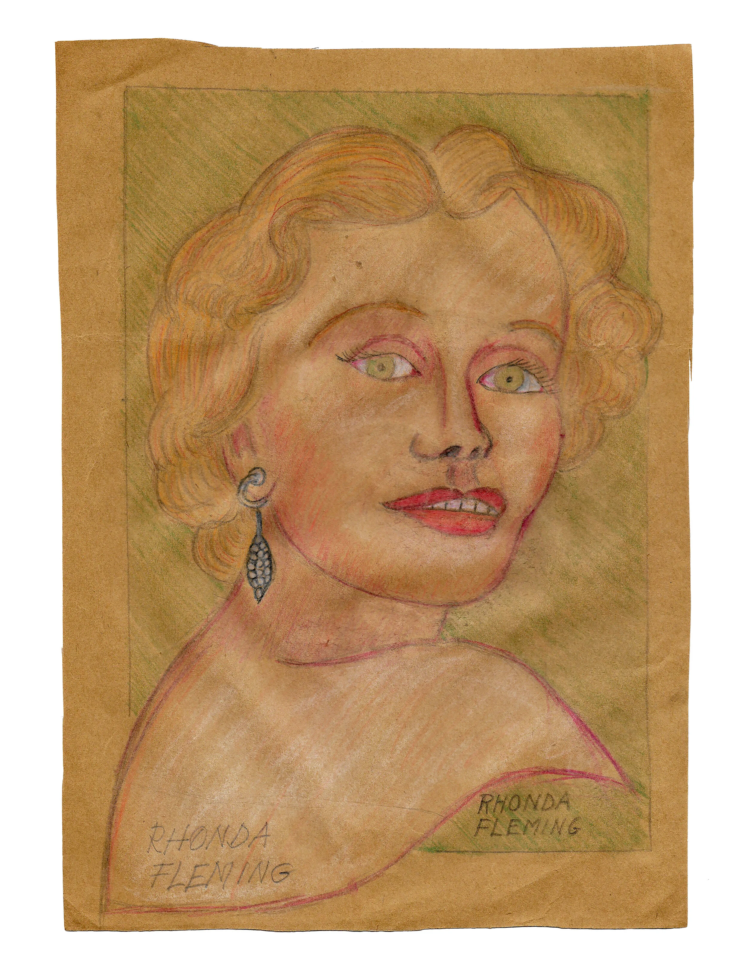
One of the most exciting discoveries of the last few weeks is that we identified the source material for a drawing featured in Part 1, a portrait of redheaded actress Rhonda Fleming. Fleming was well-known throughout her career, and featured in a number of advertisements, but this Woodbury Powder ad from the February 1949 issue of Modern Screen magazine was a perfect match.
With this pairing, we started to make some assumptions about the artist’s process:
The addition of a colored background and the cross-plane swoop of the shoulder enhance the overall composition.
The original ad is in black and white, yet the artist appears to have stayed true to their subject, as Fleming was known for her red hair and green eyes.
Small details show a consideration for the original material: the hairline, the earring, the eyebrows, and even the placement of Fleming’s name on her upper back, the same as in the ad. Why the artist wrote her name again is not known.
To use this ad as an example of the difference in advertising for Black women, the language in the Woodbury ad is important to note: sheer, satin, perfect; all representing an ideal best illustrated by the fair-skinned Fleming.
Compare that with this Black and White Bleaching Cream ad from the August 1949 issue of Ebony. The language emphasizes lightening one’s skin, presumably to look more “attractive;” the phrase “shades lighter” appears four times, and the implication is that the product will change one’s skin color on a cellular level. The model featured is light-skinned, highlighting the difference between her and the Black man she is with, whose skin is so dark he almost disappears.
Woodbury Powder’s ad gives the impression that one simply has to powder one’s face to look as perfect as Fleming; their audience is Caucasian women. Black and White Bleaching Cream, on the other hand, instructs their audience that they must change their skin on a biological level to be desired.
An important note is that while ads and standards may have changed, the skin lightening industry is still thriving around the world.
Entertainment and fan magazines proliferated in the 1940s and 1950s. With TV, radio, and film industries producing content for the masses, actors and actresses became the type of celebrities we know today. Our artist was absolutely familiar with a number of these publications.
The cover of the February 1949 issue of Radio and Television Mirror featured Marie Wilson, a well-known comedic actress. Knowing from other examples that the artist changed some elements of the source material, we considered the possibility that the drawing we had was inspired by the cover image.
Similarities include, most notably, that Wilson appears to be wearing the same top. On her face, details such as her teeth, eyelashes, eyebrows, and blush, while pretty typical for the era, do seem to be the same. Even the lines of Wilson’s neck and collarbones look similar.
But one consistent element we’ve started noticing in all of the drawings is the attention paid to the hair and hairline. In this case, the curl atop Wilson’s head appears to be the same as on the cover, even down to the small sliver of hair snaking over the ringlet. Looking at the curl on the right of the drawing and the bottom left of the cover image, the artist has flipped it to the other side of Wilson’s head, but it is located in the same position on the neck.
There are no other photos of Wilson in this or similar tops, but that doesn’t mean that alternatives from the cover photo shoot don’t exist. It does, however, give us a great line of inquiry to pursue.
Most of the recent weeks were spent looking through magazines after successfully discovering the Fleming ad, and our work paid off with even more source material discoveries. In the March 1949 issue of Movieland we found two matches, one an advertisement for DeLong bobby pins, the other a small photo from a gossip page, and the only reference we’ve been able to find to a “Gaby Andrews.”
On the reverse side of the Gaby Andrews drawing is this portrait of Linda Darnell, which we located in LIFE magazine from March 14, 1949. The artist has dropped the hat, but retained the details like eyebrows and the fall of Darnell’s hair. Even Darnell’s name seems to be written in a style almost imitative of her signature.
Solitair make-up ad, Movieland, July 1949.
This Drene shampoo ad from the January 1949 issue of Radio and Television Mirror shows how the hair industry targeted and promoted White women by using the language of “natural beauty:” this product would enhance the “natural” softness and shine of the user’s hair. By positioning the standard of beauty in such a way, the industry set up another dynamic: anything other than this Western standard of beauty was therefore “unnatural.”
Even men were targeted in such a way, evident in a 1945 series of ads from Janis hair tonic. In each one, a person from the “non-Western” world wore a traditional (or stereotyped) hairstyle, with the ad’s language making clear that these different styles wouldn’t be accepted in America.
In the case of these ads, the ideal hair is defined by what it is not. The individual cultures supposedly represented are denigrated by comparison with American style as the “modern way,” in a sense relegating anything else to the category of “primitive” and “other.”
To read more about how hair product advertisements in the 1940s and 1950s contributed to racial and gender stereotypes, we recommend this 2015 dissertation by Angela G. Liljequist, “Soft, Glossy Tresses”: Shampoo Advertisements, White Women’s Hair, and the Late- and Post- World War II Domestic Ideal” and Susannah Walker’s book, Style and Status: Selling Beauty to African American Women, 1920-1975.
When we first set out to learn more about these drawings, we had no idea what we would find. But it is clear that at least some of these pieces were inspired by source material found in magazines in the late 1940s and early 1950s - so far we’ve identified 11 potential “matches,” leaving hundreds left to identify.
This is often how research plays out; a thread leads down one path and then quickly sends you searching elsewhere. When these journeys pan out, we can examine the body of work through the lens of the sociocultural context that the women pictured, and possibly even the artist, lived and worked in. By doing so, we cannot cover up issues like racism and sexism; despite many White actresses receiving great fame and acclaim, they are still mostly written about as housewives in their downtime, wanting a husband, having a husband, and even losing a husband (and then starting the cycle over.) As mentioned, Black faces are nearly absent in mainstream entertainment publications and advertisements, thereby even stripping Black women of the domestic housewife title held by their White counterparts, despite relegating Black actresses to domestic roles in film. In fact, Black women are nearly invisible in the entertainment industry, and when targeted with ads it is for products that promise to make them even more so.


